Hey, I'm Izzy 👋
Web Design Essentials for Creative Minds
Twice a week, I’ll send you ideas you can apply immediately to elevate your website and boost conversions.

Discover 5 common website design mistakes that destroy trust and clarity—like bad navigation, poor contrast, baked-in image text, and inconsistent spacing. This breakdown uses a real homepage example to show each problem and how to fix it using UX best practices. Includes visual before/after comparisons and the full Figma file.
Most websites don’t fail because of bad products—they fail because of bad design decisions.
In this teardown, I’ll show you 5 common website design mistakes that instantly kill trust, clarity, and user engagement. And I’ll show you how I fixed them using actual UX best practices—with full before-and-after visuals.
The original site used a two-row navigation bar—one for primary links and another for CTAs like “Where to Buy.” It bloats the layout and forces users to think too much before they even scroll.
I collapsed the nav into a single streamlined row. Primary links stay accessible, while secondary CTAs are styled distinctly but don’t demand a whole row of their own.
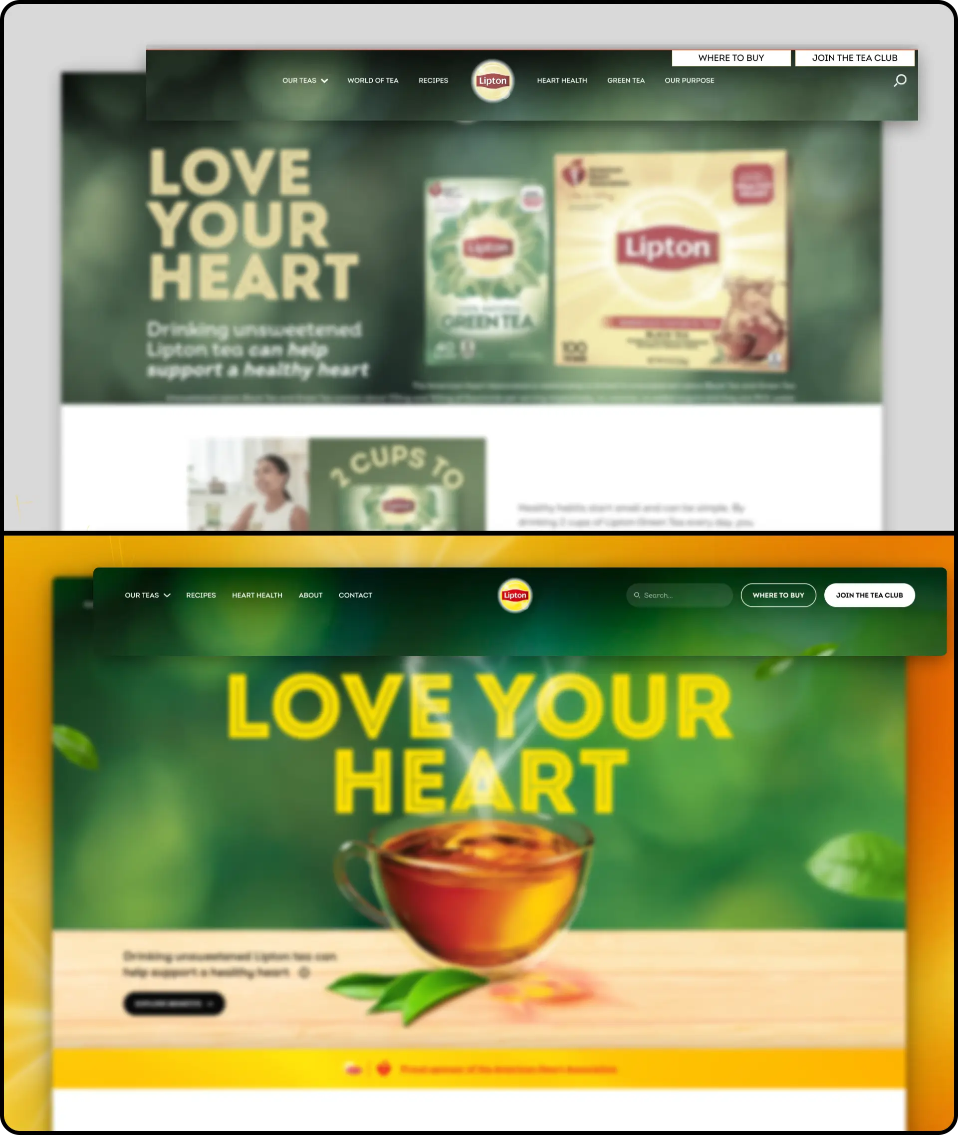
Side-by-side comparison of two-row nav (before) vs single streamlined nav (after)
The homepage relied heavily on generic, stock lifestyle images that looked disconnected from the product. It screamed “template.”
I replaced the imagery with a warm, product-centric visual: a steaming teacup with heart-shaped steam. It feels intentional, on-brand, and instantly communicates warmth and care.
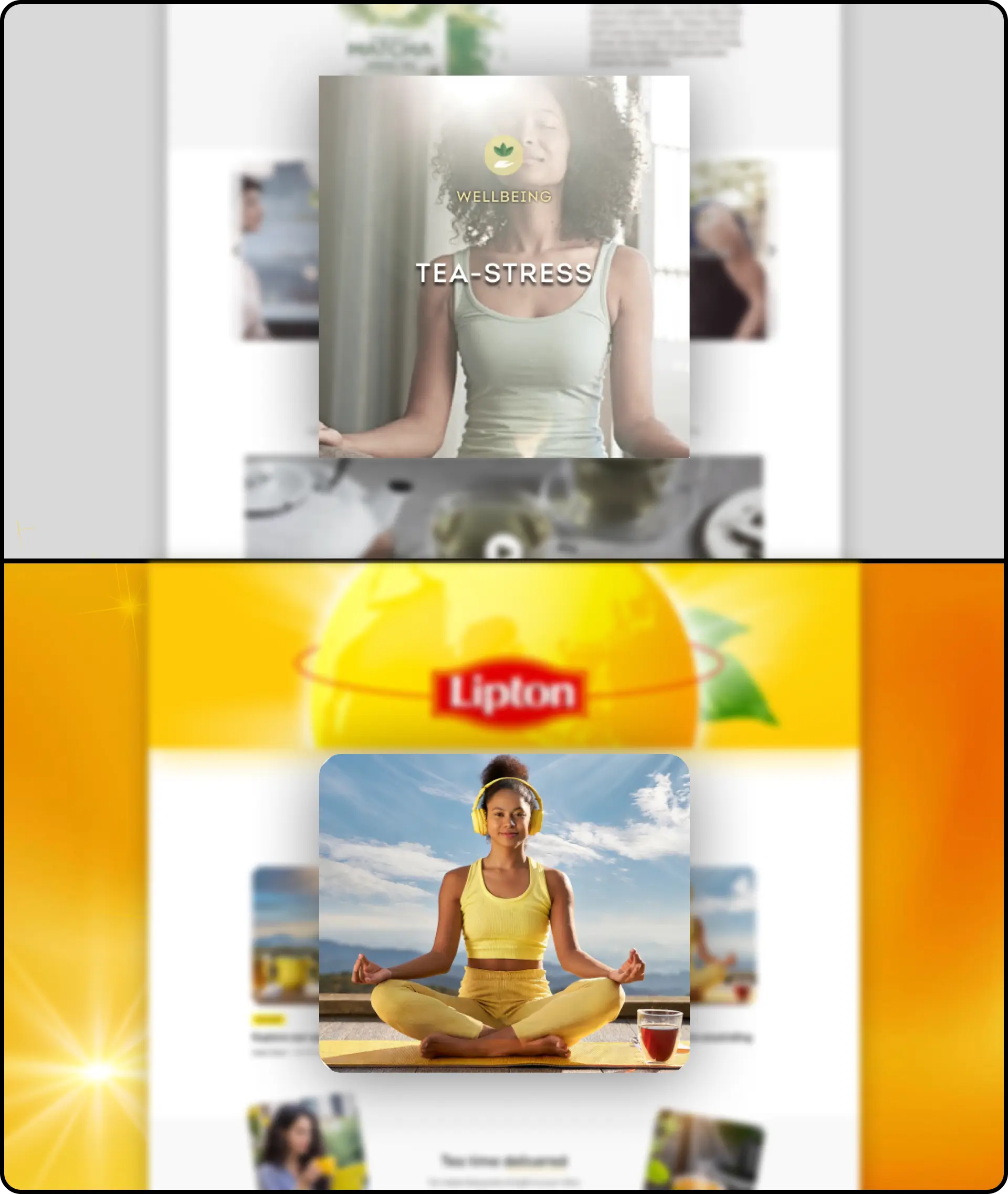
Side-by-side of generic stock photo vs branded product-centric hero image
Multiple blocks of text were placed directly over busy images—often with no background treatment or contrast management.
I applied proper contrast strategies—like darkening the image behind text or moving it outside the image block entirely.

Example of hard-to-read text over image (before) vs high-contrast or separated layout (after)
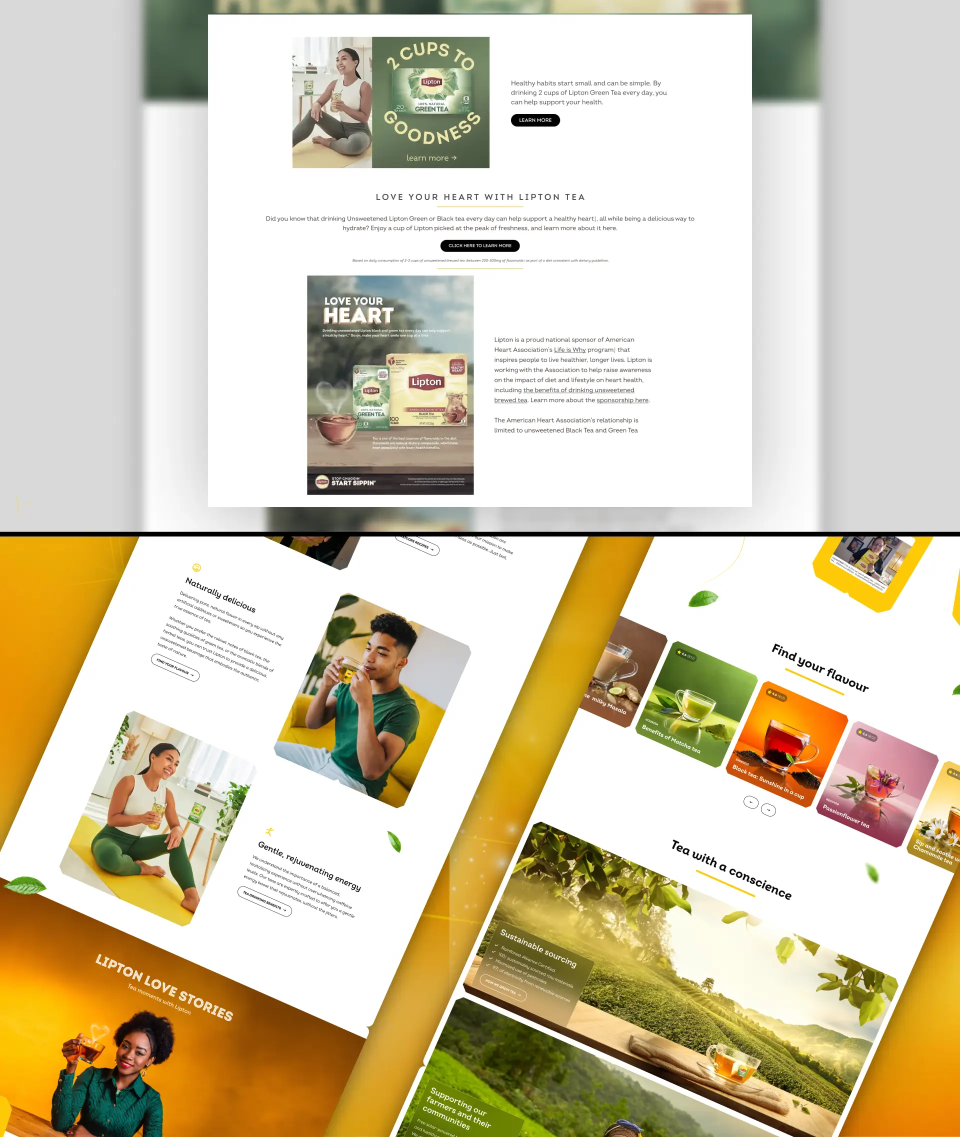
Some of the most important headlines were baked into images instead of being actual HTML text. For example: “2 Cups to Goodness” is just part of a JPG.
I rebuilt all sections using live text layered over clean visuals, styled identically but now fully readable by both users and machines.
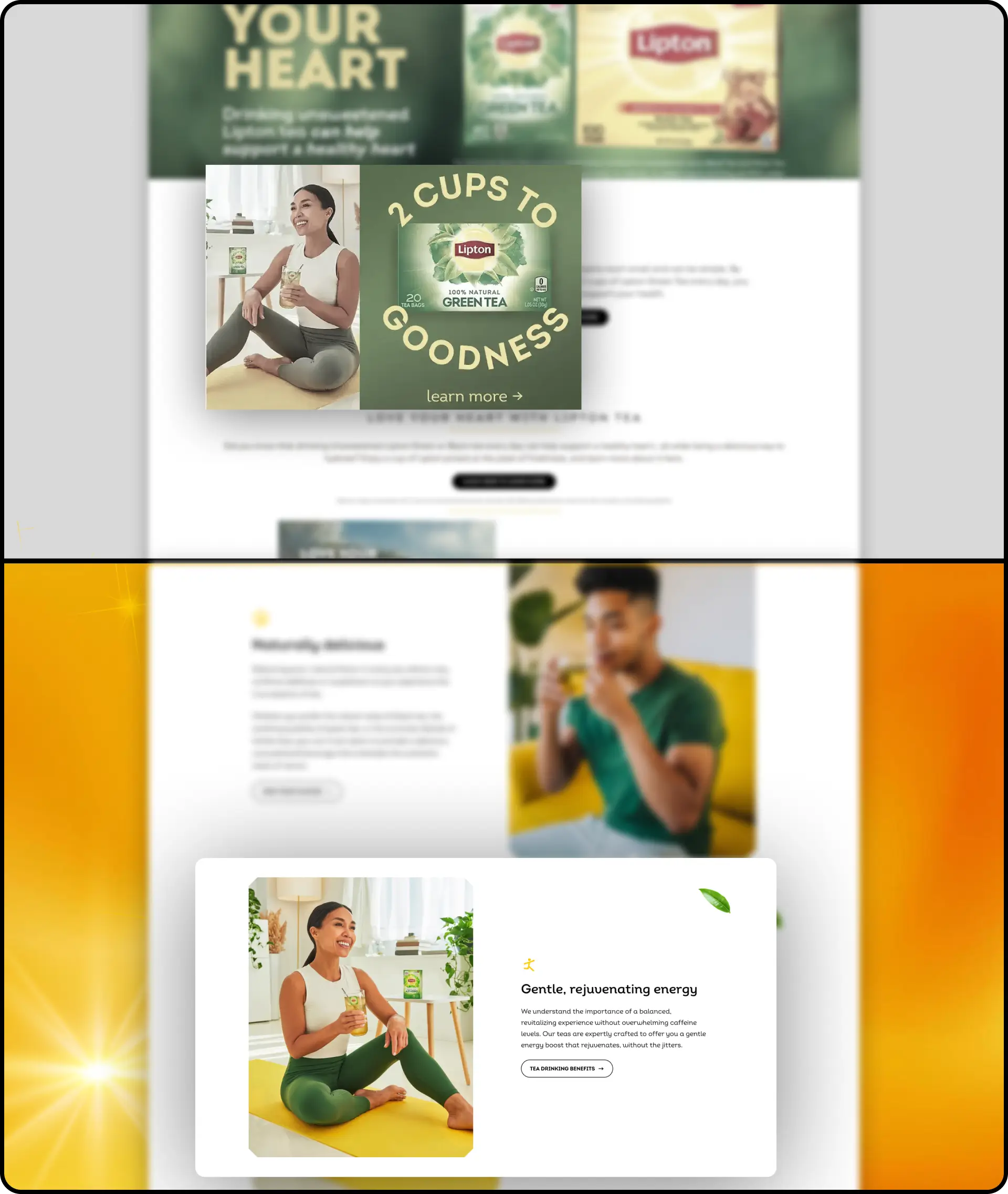
Image of baked-in text vs same layout rebuilt using HTML/CSS text
There was no spatial system in place. Some elements were cramped, others floated awkwardly. It felt like a patchwork rather than a grid.
I introduced a tight, modular spacing system with consistent padding, margins, and content width. Every section now flows naturally.
Highlight spacing inconsistencies (before) vs aligned modular grid (after)
The difference between a mediocre homepage and a high-performing one isn’t flashy animations or trendy design—it’s clarity, consistency, and intentionality.
This teardown shows how fixing just a handful of real-world UX mistakes—bad navigation, poor contrast, weak hierarchy—can totally transform user perception and trust.
No matter how big the brand, visual credibility is earned, not inherited. Users subconsciously judge whether a site feels trustworthy within the first few seconds—and that judgment is almost never about the logo or color palette. It’s about clarity. Is the layout clean? Is the spacing intentional? Is the imagery authentic? If any of those feel off, the whole experience collapses. That’s why seemingly small changes—like improving line height, tightening layout rhythm, or replacing stock photos—have outsized effects. They signal care, quality, and professionalism in a way users can’t always articulate but instantly feel.
Every fix you saw above—spacing rules, contrast overlays, hierarchy systems—is fully documented in the Figma file.
Includes: