Hey, I'm Izzy 👋
Web Design Essentials for Creative Minds
Twice a week, I’ll send you ideas you can apply immediately to elevate your website and boost conversions.

Pokémon cards have been around since 1999. So, card designers have had plenty of time and iterations to come up with stellar visual ideas to keep things interesting. Let's see what kind of takeaways we can extract from Pokémon card design.
At age 29, I’ve gotten back into collecting cards, revisiting a childhood hobby that once brought me immense joy.
This nostalgic journey down memory lane has reignited my passion for the world of collectible cards, and as a visual design enthusiast, I couldn't help but notice all of the impressive design decisions found in Pokémon cards, both the new releases and the cherished classics.
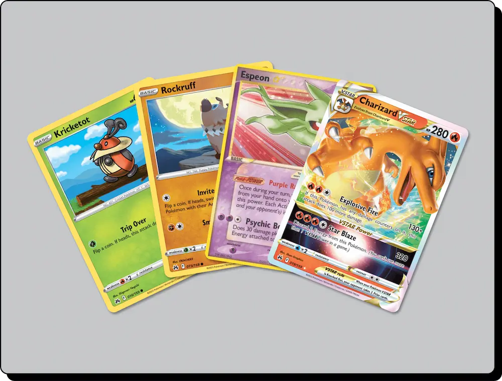
As I delved deeper into the intricate world of Pokémon cards, I realized that there's more to these colorful rectangular pieces of cardboard than meets the eye. Here are some key visual design takeaways that make Pokémon cards a fascinating subject for anyone interested in visual design.
.webp)
Mood lines, a subtle yet incredibly effective design element, play a crucial role in capturing the very essence of a Pokémon within the confines of a card. These lines, often characterized by their varying shapes, thickness, and colors, are used to depict the emotional state, energy, and personality of the creatures. They breathe life into the artwork and enhance the overall visual storytelling of each card.
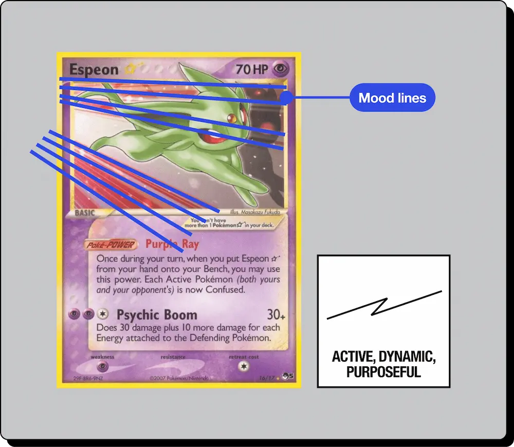

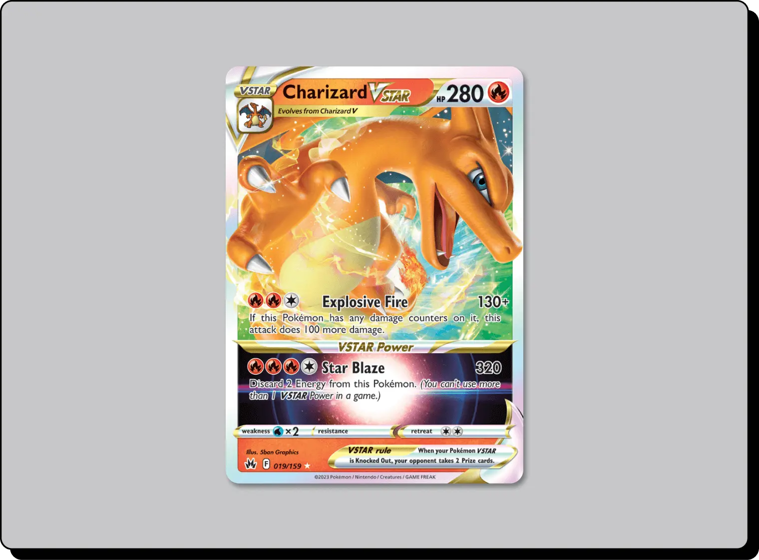
Charizard, known for its intense and fierce nature. The mood lines in its card artwork might consist of bold, dynamic, and angular lines. These lines not only evoke a sense of fiery energy but also reflect Charizard's aggressive and powerful demeanor. When you look at this card, you can practically feel the heat and intensity of the flames.
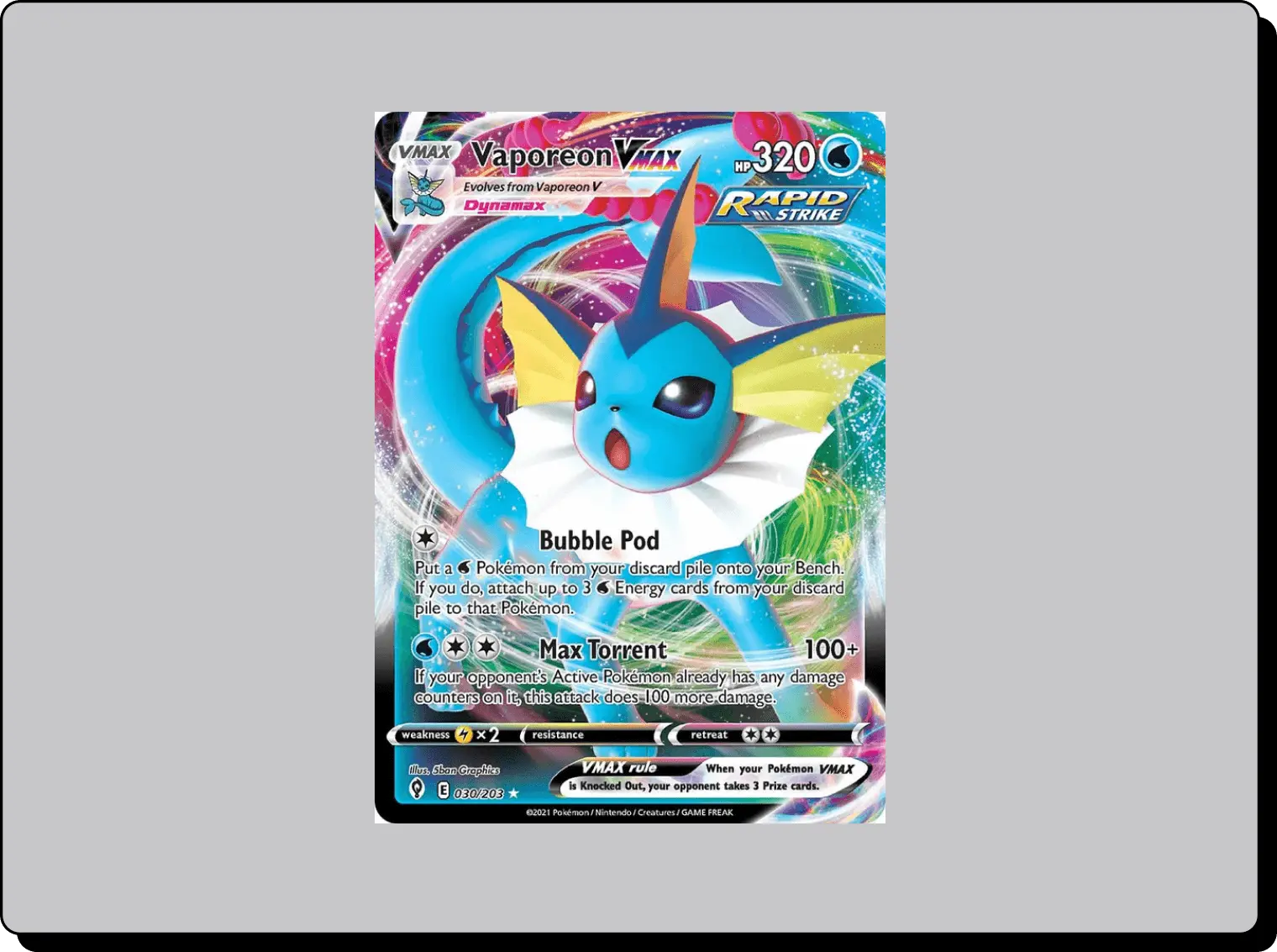
On the other hand, consider a Water-type Pokémon like Vaporeon. Its mood lines would be fluid, curvy, and calming, mirroring the tranquil nature of water. These lines create a sense of flow and serenity, instantly conveying the idea of Vaporeon's affinity with aquatic environments.
The careful choice of mood lines not only reflects the elemental attributes of a Pokémon but also provides a glimpse into their personality. The jagged lines of an Electric-type Pokémon like Pikachu might suggest a spark of electricity, symbolizing its high-energy and mischievous character. In contrast, a Psychic-type Pokémon might have intricate, mesmerizing lines that represent its mystical and enigmatic qualities.
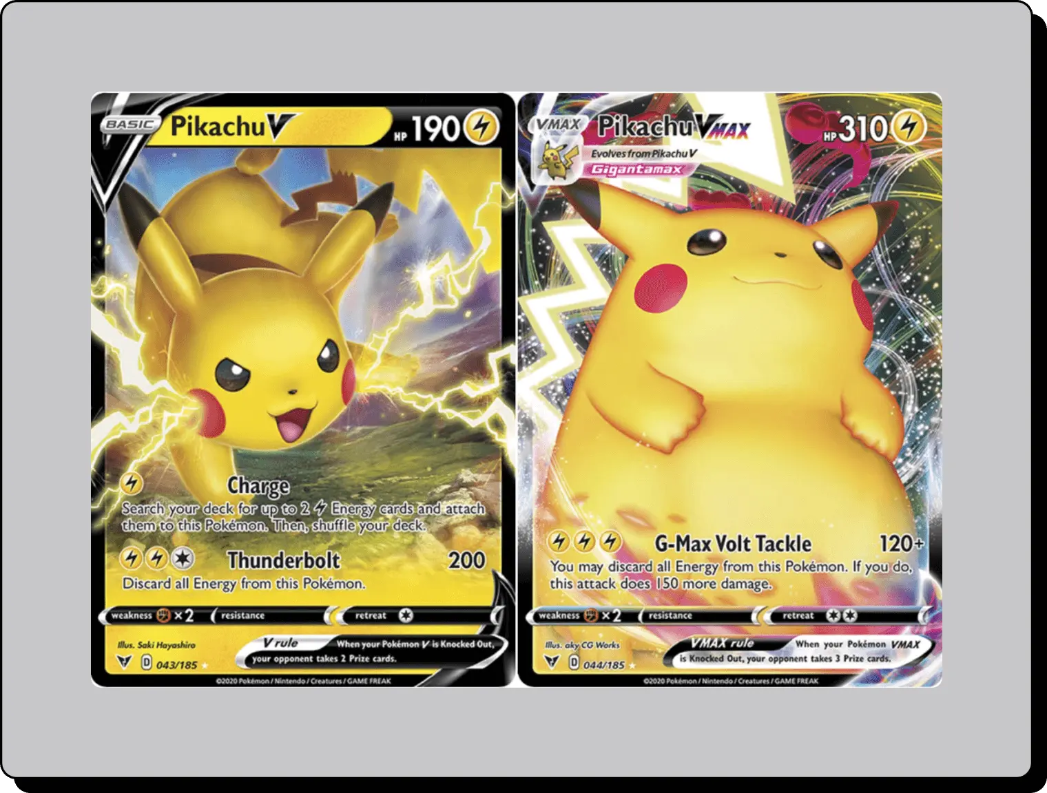
Mood lines are a terrific tool for designers. Use them.
'Full art' cards are a category of their own, known for their breathtaking artwork that extends from edge to edge. These cards showcase the Pokémon in all their glory, surrounded by vibrant illustrations that create an immersive viewing experience for collectors.
Full art Pokémon cards are a visual treat, but the intricate artwork can sometimes pose a challenge to the legibility of the text displayed on the card. To address this, designers often employ a simple yet effective solution by creating a white border around the card's text elements.

I appreciate the meticulous thought that goes into ensuring that Pokémon cards are not just visually stunning but also highly functional. The white text border on full art cards is a brilliant example of how design can seamlessly integrate beauty and usability.
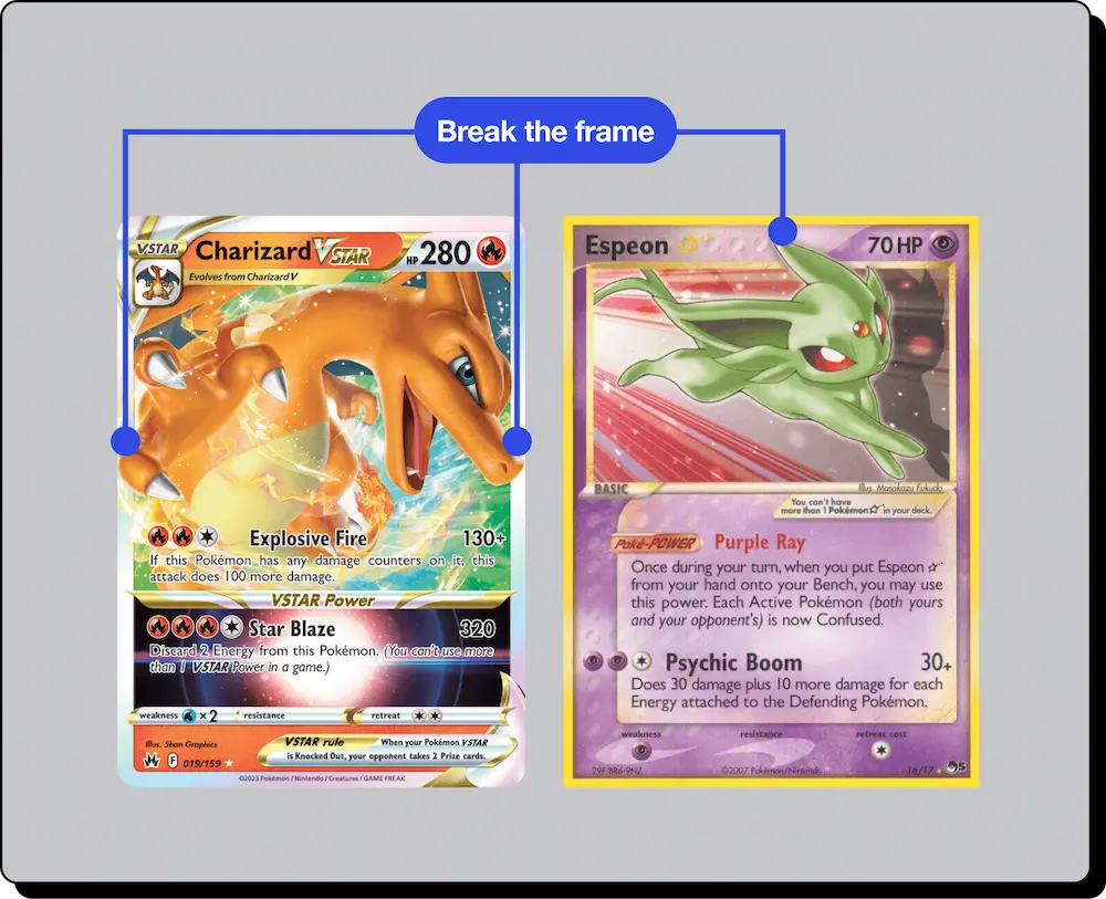
When a Pokémon 'breaks the frame,' it means that the character's artwork extends beyond the typical borders of the card, often spilling over into the surrounding area. This clever design choice accomplishes several significant objectives:
1. Depth and Immersion: By allowing the Pokémon to transcend the confines of the card, it creates a sense of depth and immersion. It's as if the creature is breaking free from the two-dimensional space and stepping into our world. This adds an element of dynamism to the artwork, making the Pokémon appear more vivid, almost as if it could leap off the card at any moment.
2. Attention-Grabbing: Pokémon cards often feature vibrant and intricate artwork that deserves to be showcased. When a Pokémon extends beyond the frame, it instantly draws the viewer's attention. This design element serves as a visual hook, compelling collectors to engage more deeply with the card and appreciate the richness of the illustration.
3. Storytelling: Breaking the frame allows for a unique storytelling opportunity. It can convey a sense of movement, action, or even interaction with other Pokémon. For example, a card might show Pikachu leaping out of the frame to launch a powerful Thunderbolt attack, or Charizard might appear as if it's soaring into the sky. This narrative aspect adds an extra layer of fascination to the card and creates a more immersive experience.
4. Emotional Connection: When a Pokémon breaks the frame, it can also create a stronger emotional connection between the collector and the creature. It's as if the Pokémon is reaching out to the viewer, forging a more personal bond. This connection is essential, as it's not just about collecting cards; it's about forming a connection with the Pokémon world.
All spacing values are multiples of x, the base spatial unit. Learn more about spatial systems here.
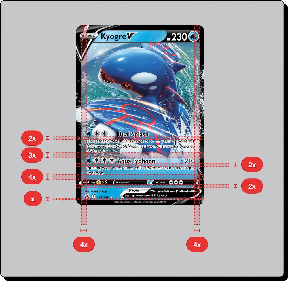
Pokémon cards are designed to convey information efficiently. Each card contains essential details, such as the Pokémon's name, attacks, abilities, and flavor text. Consistent spacing ensures that all of this information is presented in a clear and organized manner. It prevents text from crowding or overlapping, which might otherwise hinder the card's readability. This principle is essential for players during gameplay when quick reference to card details is imperative.
Beyond readability, consistent spacing contributes to the overall aesthetic balance of the card. Whether it's the alignment of text, the placement of symbols, or the positioning of artwork, having a uniform spacing system creates a sense of order and harmony. It makes the card visually appealing and ensures that no single element dominates or distracts from the others.

1. Information Prioritization: Pokémon cards contain a wealth of information, including the Pokémon's name, attacks, abilities, retreat costs, and flavor text. To make this information easily digestible, designers use position and scale to establish a hierarchy. Vital details, like the Pokémon's name and its primary attack, are usually placed prominently at the top of the card, using larger text to emphasize their importance. As a result, players and collectors can quickly identify key data.
2. Focal Points: Each Pokémon card features captivating artwork, and this art is often the card's focal point. By using scale and positioning, the card designers ensure that the Pokémon illustration remains the center of attention. The Pokémon is typically larger and placed centrally, creating a natural focal point that immediately draws the viewer's gaze.
3. Readability: In addition to prioritizing information, positioning and scaling elements ensure that text remains legible. Smaller, secondary details, such as retreat costs or flavor text, are often placed at the bottom or sides of the card and are smaller in scale. This approach maintains clarity and readability without overwhelming the viewer.
Every element on a Pokémon card is thoughtfully placed, meticulously considered, and purposefully designed to offer an engaging and immersive experience. Whether you're a seasoned collector or someone with an appreciation for art and design, Pokémon cards teach us a valuable lesson – that design goes beyond mere aesthetics. It's about the stories, the emotions, the information, and the user experience it conveys.
From the visual storytelling of the artwork to the clear communication of information, Pokémon cards masterfully exemplify the marriage of art and function. As visual designers, we can draw inspiration from this meticulous approach, and as fans, we can continue to appreciate the artful craftsmanship that makes Pokémon cards so much more than collectibles – they are a canvas of creativity, a gateway to nostalgia, and a testament to the power of design.