Hey, I'm Izzy 👋
Web Design Essentials for Creative Minds
Twice a week, I’ll send you ideas you can apply immediately to elevate your website and boost conversions.

A brutal breakdown of homepage design mistakes using Lipton’s site. Learn what kills UX, hurts conversions, and how to fix it with real examples.
Most homepages don’t fail because of one big mistake.
They fail because of a stack of small, invisible ones that quietly kill clarity, trust, and conversions.
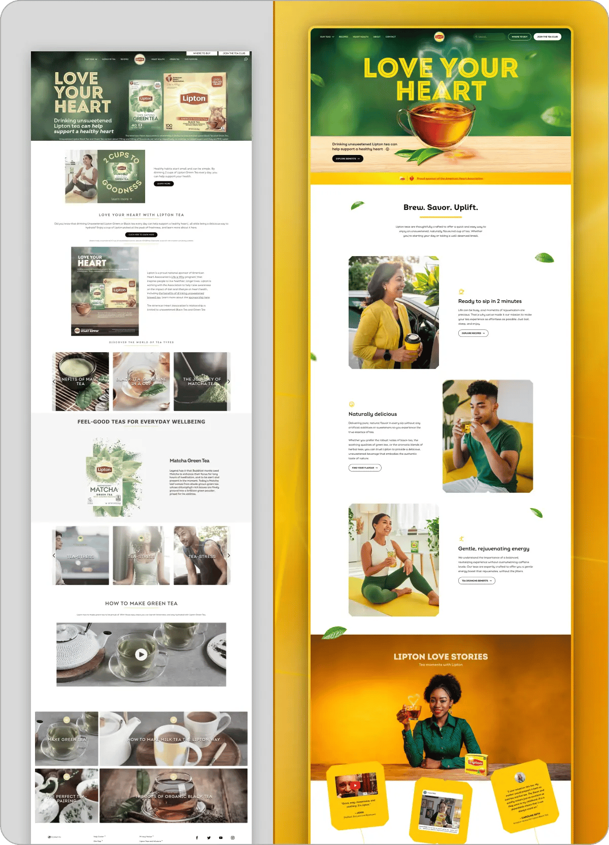
Lipton’s homepage is a perfect example.
At first glance, it looks fine. Polished. On-brand. Professional.
Spend 10 seconds on it and everything starts to fall apart.
This breakdown focuses on three of the most common homepage design mistakes I see everywhere and how to fix them.
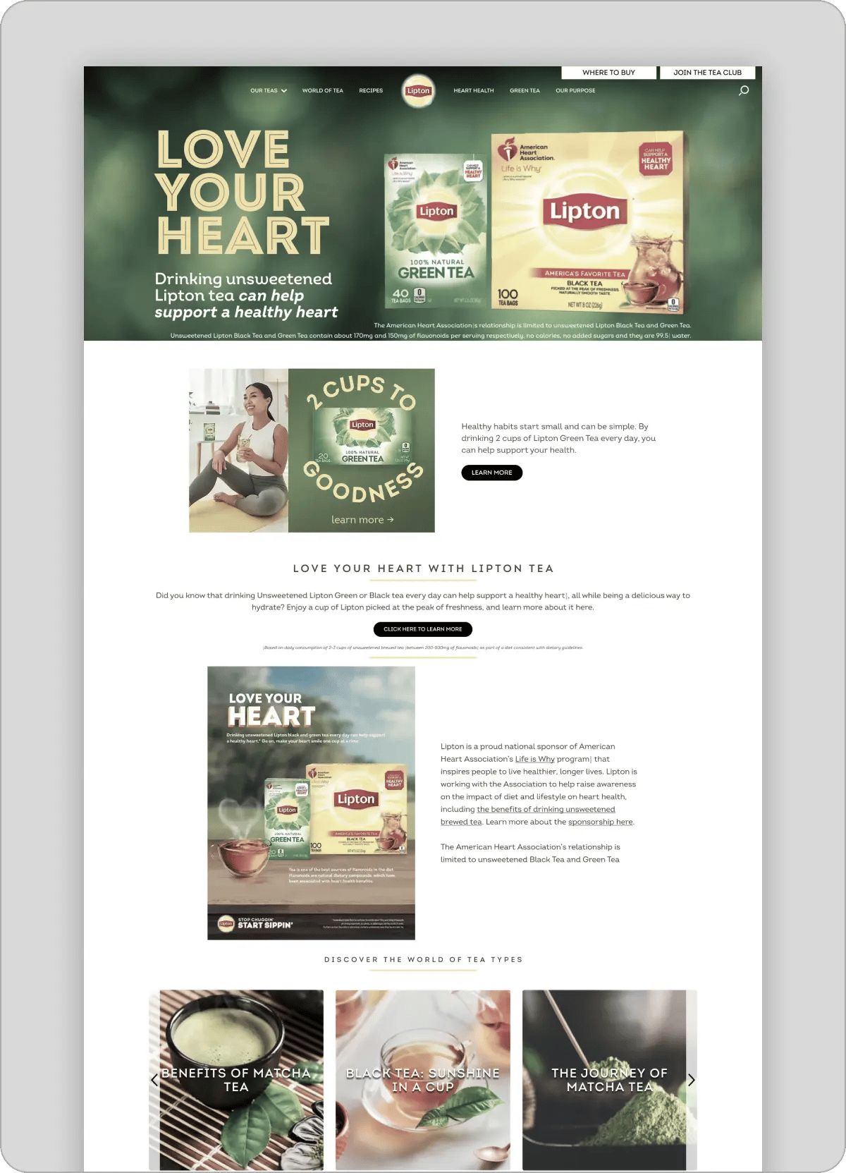
One of the most damaging homepage design mistakes is turning your hero into a static image.
It looks like a webpage.
But it behaves like a poster.
Here’s what that breaks immediately:
It’s not just a technical issue.
It feels wrong.
There’s something subtly off about it. Like you’re looking at a screenshot instead of a product.
That kills trust faster than people realize.
If your first screen isn’t functional, the rest of the page doesn’t matter.
People don’t “figure it out.”
They leave.
The solution is simple, but most brands still mess it up.
Now the page behaves like a product.
Not a billboard.
And that one change alone massively improves:
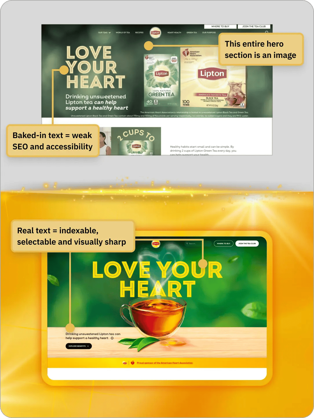
Another massive homepage design mistake: no identity.
No system.
No recurring idea.
You could swap the logo and this page would still “work.”
That’s a problem.
Because if your design works for everyone, it belongs to no one.
Everything feels disconnected.
Like a collection of sections instead of a cohesive brand.
Design isn’t just about looking good.
It’s about being remembered.
If your site has no signature:
That’s the entire chain.
👉 No identity = no revenue leverage
Instead of random styling, build a system people subconsciously pick up on.
In this redesign:
Same ideas.
Different expressions.
Repeated consistently.
Now the page feels like one brand.
Not ten different designers working independently.
This is the difference between “nice design” and “memorable design.”
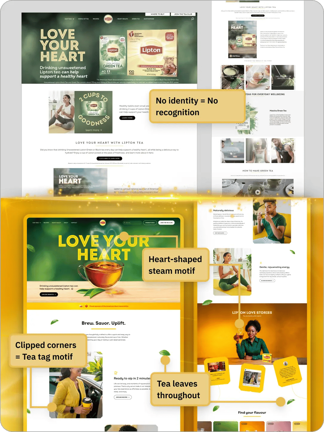
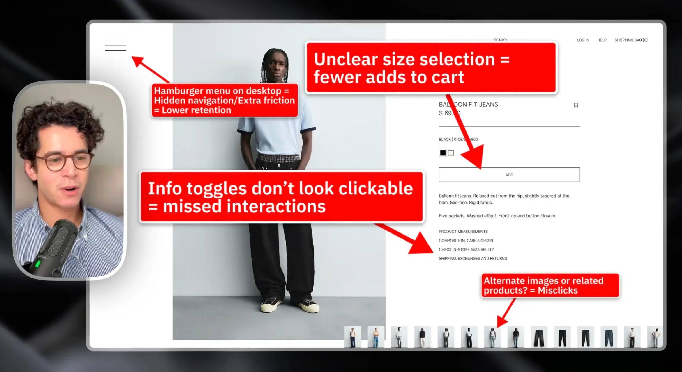
This is one of the most common website UX mistakes.
And one of the hardest to fix.
The page is full of text.
But nothing sticks.
It creates the illusion of substance.
But there’s no actual takeaway.
Users aren’t reading for entertainment.
They’re scanning for answers.
If they don’t get clarity quickly:
👉 No clarity = no conviction
And no conviction means no action.
Every section should answer one simple question:
“What do I actually get?”
That’s it.
So instead of vague claims:
Now the page teaches something.
And when users learn something, they trust you more.
👉 Every section builds understanding instead of noise
These aren’t random issues.
They all come from the same root problem:
Designing for appearance instead of function.
If the answer is no, the design failed.
No matter how polished it looks.
Look at the difference holistically.
The original page:
The redesigned version:
That shift does more than “improve UX.”
It directly impacts:
If you take nothing else from this, take this:
Your homepage is not a canvas.
It’s a system.
And systems need:
If you’re reviewing your own homepage, ask:
If you hesitate on any of those…
You’ve found your bottleneck.
Most websites don’t need a full redesign.
They need better decisions.
Smarter structure.
Clearer communication.
That’s where the real leverage is.
I only take 3 private teardowns per week.
A clear-eyed teardown showing what’s wrong, why it matters, and what to fix first.
Delivered in 48 hours. Fully refunded if it doesn’t deliver clarity.
Never second-guess a design decision again.

Learn how to diagnose and build resilient layouts, speak about design confidently, and impress clients & employers.
Fully annotated Figma files. Every decision explained.
Includes all past & future redesigns. Fully refunded if it's not useful.