Lipton’s Homepage is a Disaster… So I Fixed It (it was impressively bad)

Key points

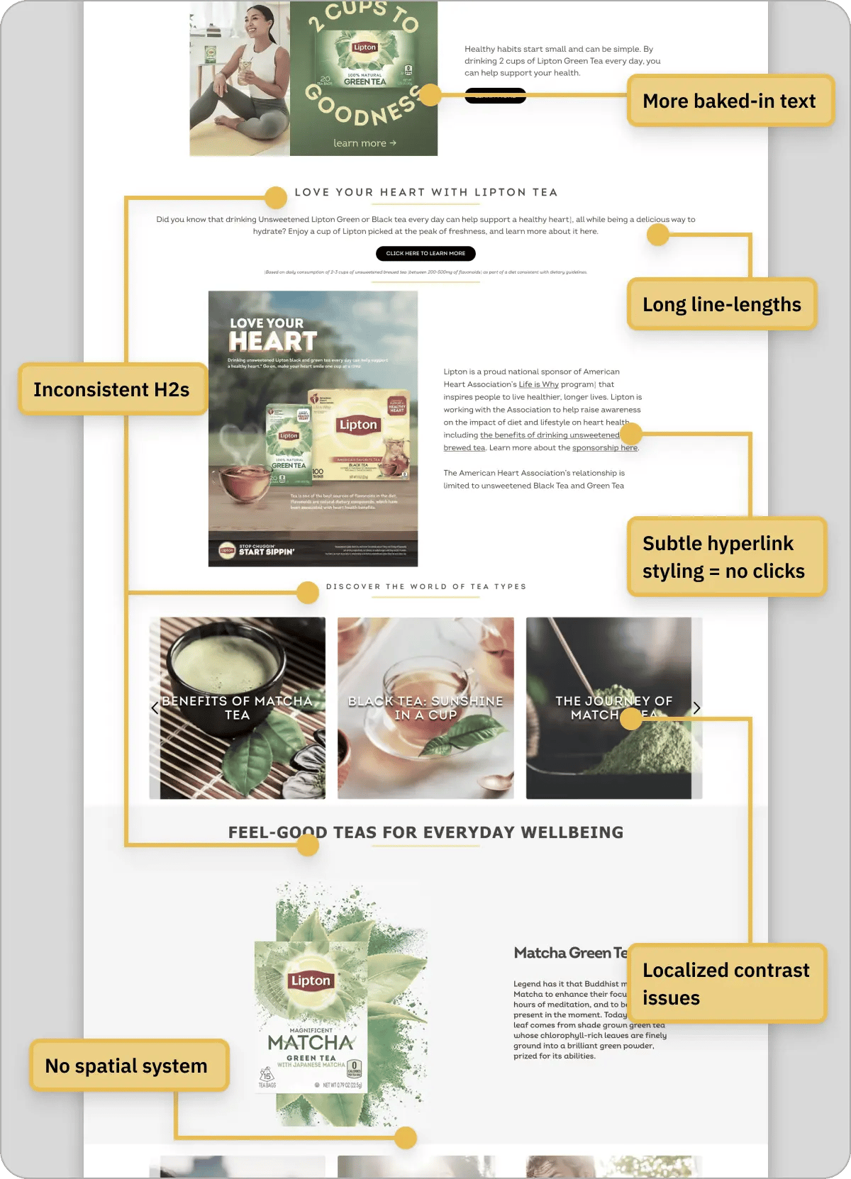
The hero is just a static image pretending to be UI. There’s no recognizable visual system, nothing that makes this feel uniquely Lipton. And the content is all surface, lots of words, no real substance.

Lipton's homepage looks like a leaked rough draft. Here’s how I redesigned it.

Before

Cluttered layout with weak hierarchy and generic visuals makes the page hard to scan or trust

What’s Broken

Issue #1

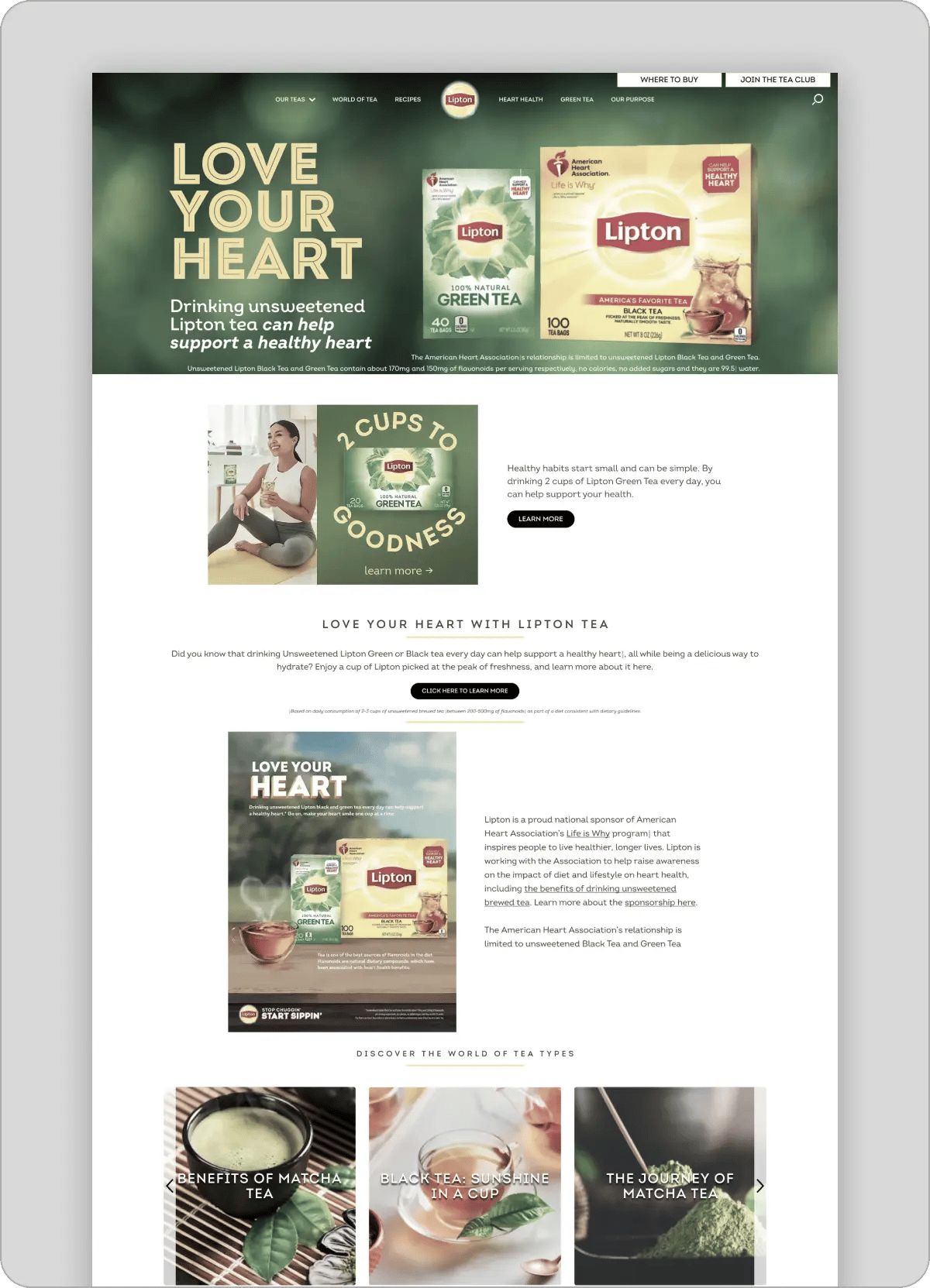
The hero section is fake.

  • The entire hero is one big image
  • Text isn’t real → can’t be read, selected, or indexed
  • No real structure, no real CTA

👉 It looks like a page, but behaves like an ad

Consequence

It kills usability, discoverability, and trust instantly.

  • Google can’t read it → no SEO
  • Users can’t interact with it → no flow
  • Everything feels static and fake

👉 If the first screen isn’t functional, nothing else matters

Key messaging locked inside images reduces accessibility, SEO, and clarity

Fix

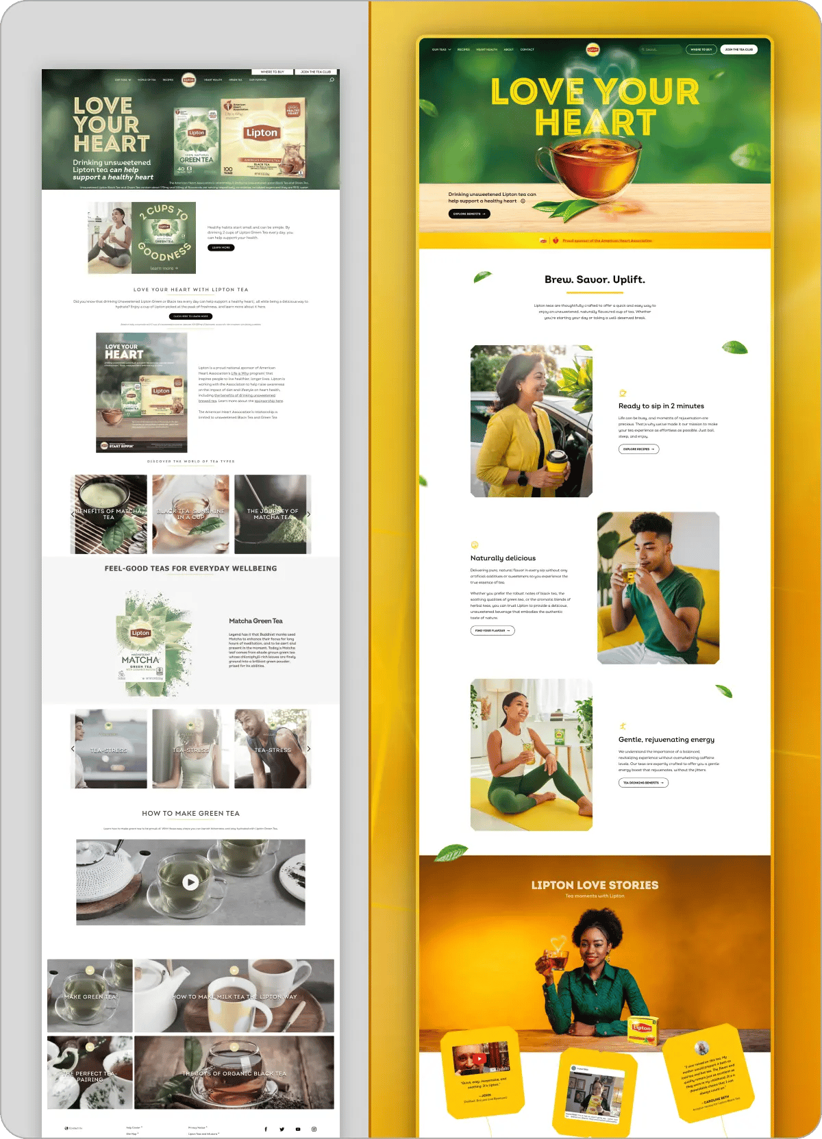
Turn it into an actual interface. Not an image.

  • Real text (H1, supporting copy)
  • Proper layout (not baked-in design)
  • Clear primary CTA
  • Product grounded in a real scene

👉 Make it feel like something you can use, not just look at


Issue #2

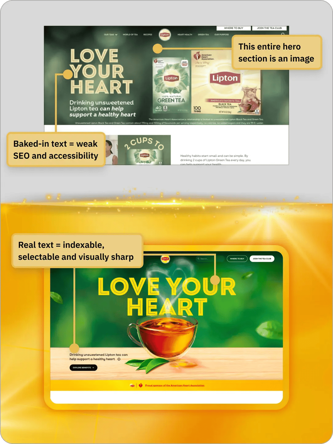
There's no signature

  • There’s no consistent look or recurring idea
  • It never builds a recognizable style
  • You could swap the logo and it still works

👉 Nothing here is distinctly Lipton

Consequence

It becomes forgettable

  • No identity → no recognition
  • No recognition → no brand recall
  • No recall → no preference

👉 If people don’t remember you, they won’t choose you

Lack of visual identity replaced with cohesive system using consistent motifs and brand-specific elements

Fix

Introduce recurring motifs

  • Tea tags, steam, leaves
  • Repeat them across sections in different forms
  • Build a system people start to recognize

👉 Make it feel like one brand, not a collection of sections


Issue #3

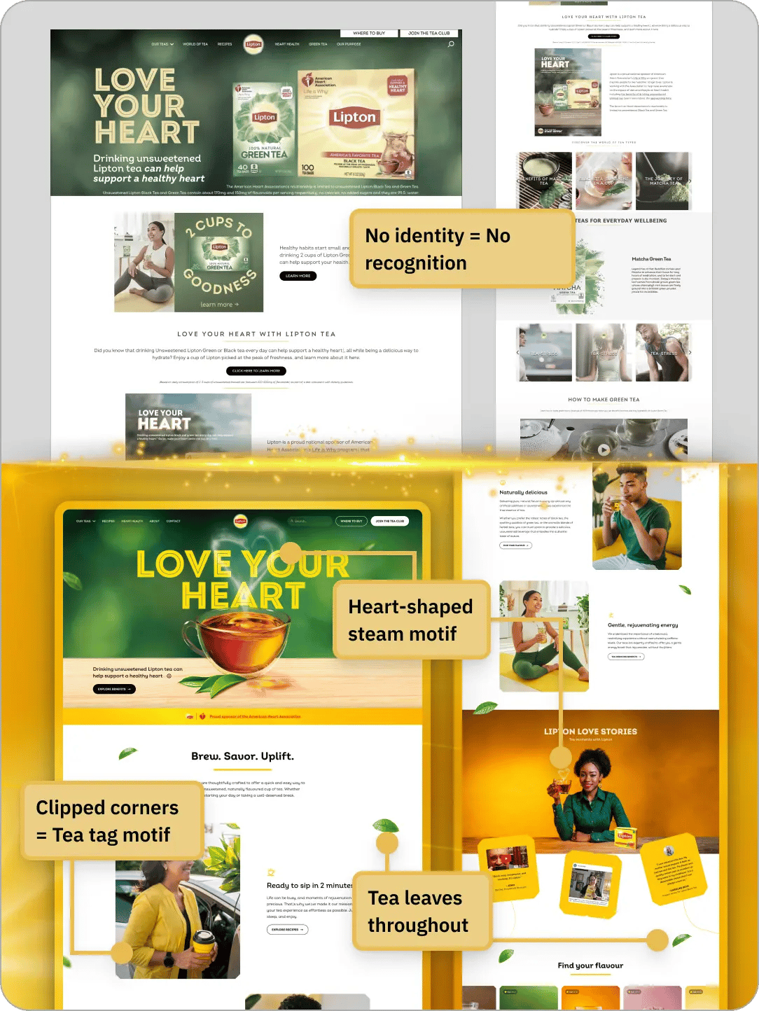
It says a lot but tells you nothing

  • Same “heart health” claim repeated with zero new info
  • Paragraphs full of words… but no real takeaway
  • Stock-looking visuals that don’t add meaning

👉 It sounds informative, but leaves you with nothing concrete

Consequence

No real takeaway → no reason to care

  • No clarity = no conviction
  • If people don’t learn anything, they don’t trust anything
  • Feels like marketing fluff → gets ignored instantly

👉 You read it… and still don’t know why Lipton is worth choosing

Repetitive claims, vague copy, and stock visuals fail to build trust or communicate real value

Fix

Make every section teach something real.

  • Replace vague claims with specific, tangible benefits
  • Each section answers: “What do I actually get?”
  • Use visuals that reinforce the message, not decorate it
  • Add proof: sourcing, real use cases, real people

👉 Every section teaches something → builds trust → drives action


By the way: This is just 3 out of dozens of fixes. Explore the full, step-by-step redesign file → RedesignVault

Concrete benefits and real-world visuals replace generic claims, making the message credible and specific

Before & After

Unstructured, forgettable page transformed into a clean, branded layout with clear hierarchy and stronger visual flow

If your site isn’t converting, I’ll tell you exactly why.

I only take 3 private teardowns per week.

Clear UX issues tied directly to lost conversions show exactly what’s hurting performance

A clear-eyed teardown showing what’s wrong, why it matters, and what to fix first.

Get a teardown →

Delivered in 48 hours. Fully refunded if it doesn’t deliver clarity.

Want the full redesign file?

Never second-guess a design decision again.

Step-by-step redesign system shows how weak layouts are transformed into high-converting structures

Learn how to diagnose and build resilient layouts, speak about design confidently, and impress clients & employers.

Fully annotated Figma files. Every decision explained.

Get the redesign files →

Includes all past & future redesigns. Fully refunded if it's not useful.