Hey, I'm Izzy 👋
Web Design Essentials for Creative Minds
Twice a week, I’ll send you ideas you can apply immediately to elevate your website and boost conversions.

Product page design best practices that increase ecommerce conversions. Learn how visual hierarchy, product images, and UX decisions impact buying behavior using real examples from Amazon.
Most ecommerce product pages fail for a simple reason: they try to do too much at once.
Promotions. Banners. Upsells. Badges. Social proof. Shipping promises. Discounts. Subscriptions. Cross-sells.
Everything fights for attention.
And when everything fights for attention, nothing wins.
That’s why understanding product page design best practices matters. Good ecommerce UX doesn’t overwhelm users. It guides them.
The goal is simple: help someone decide “Do I want this?” and “How do I buy it?” as quickly and confidently as possible.
When product pages break this rule, conversions drop.
Let’s walk through three extremely common product page UX mistakes—and how fixing them dramatically improves ecommerce performance.
One of the most common ecommerce UX mistakes is visual noise.
Designers often underestimate how quickly clutter destroys decision-making.
%20%E2%80%94%20Before.webp)
Look at the typical product page structure on large ecommerce sites. Multiple banners appear before the user even processes the product itself.
Full-width purchase history notifications. Pricing repeated in different areas. Promotions stacked above core information. Long paragraphs of product details dumped into the layout.
Every element is technically useful.
But together, they create friction.
The brain has to process too many competing signals.
And when users hesitate—even for a few seconds—conversion rates suffer.
This is where visual hierarchy in web design becomes critical.
Strong product page UX prioritizes information like this:
Everything else should support those elements—not compete with them.
%20%E2%80%94%20Issue%201.webp)
A cleaner ecommerce product page layout solves this by simplifying and contextualizing information.
For example:
The result is the same information—but dramatically easier to scan.
Good design isn’t about removing information.
It’s about removing confusion.
Another major problem on many ecommerce product pages is the use of pre-selected subscription options.
At first glance, this seems harmless.
Subscription programs increase lifetime value. They generate predictable revenue. So many ecommerce sites quietly make them the default purchase option.
But this creates a serious UX problem.
%20%E2%80%94%20Issue%202.webp)
When users don’t explicitly choose a subscription, they may accidentally sign up for recurring deliveries.
That leads to a predictable chain reaction:
Unexpected charges → customer frustration → refund requests → support tickets → lost trust.
This type of pattern falls into a category known as dark pattern UX—design choices that push users toward decisions they didn’t consciously make.
And while dark patterns can increase short-term conversions, they almost always damage long-term brand trust.
Better product page UX design prioritizes clarity instead.
A simple change fixes the problem:
Remove the automatic selection.
Let users actively choose between a one-time purchase or a subscription.
This small shift sends a powerful signal: the brand trusts the customer to make the decision.
Ironically, this often improves long-term conversion rates.
Because when customers trust the purchase process, they come back.
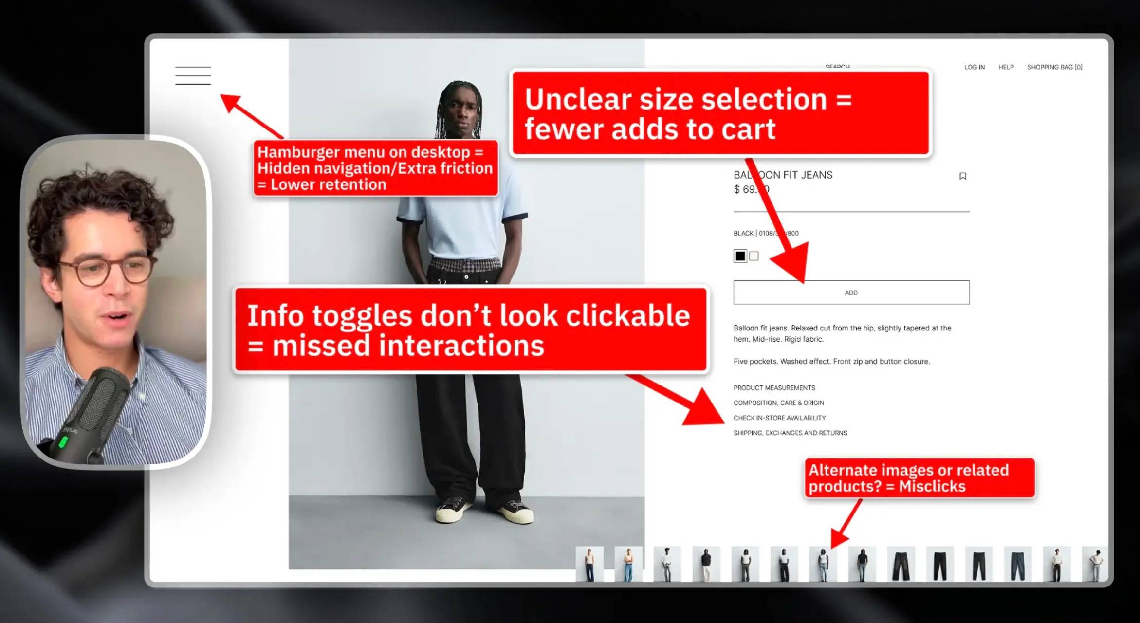
The most important element on any ecommerce product page isn’t the description.
It isn’t the pricing.
It isn’t the promotion.
It’s the product image.
Customers can’t touch or test a product online. Images are their primary way to evaluate what they’re buying.
Yet many ecommerce product pages treat images as just another component in the layout.
That’s a mistake.
%20%E2%80%94%20Issue%203.webp)
Small or visually crowded product images introduce uncertainty.
And uncertainty slows buying decisions.
Strong ecommerce product page design does the opposite. It makes the product visually dominant.
That means:
When customers can clearly evaluate the product, hesitation disappears.
And confidence increases.
In ecommerce conversion optimization, confidence is everything.
The easier it is for someone to imagine owning the product, the easier it is for them to click “Add to Cart.”
Many ecommerce teams treat product pages as information hubs.
But the best ecommerce product pages act more like decision engines.
Their job isn’t to show everything.
Their job is to guide the user toward one clear action.
That’s why the best product page design best practices revolve around three principles:
The product should visually dominate the page. Everything else supports the buying decision.
Users shouldn’t need to process ten different elements before understanding the product.
Transparent pricing, honest purchase options, and simple UX create confidence.
When these principles work together, product pages feel effortless.
Users don’t analyze the design.
They simply decide.
Many companies believe improving ecommerce conversions requires major redesigns.
In reality, small UX adjustments often produce the biggest gains.
Simplifying visual hierarchy.
Removing unnecessary banners.
Clarifying purchase options.
Prioritizing product imagery.
None of these changes are dramatic.
But together, they transform how users experience a product page.
And better experiences lead directly to higher conversions.
%20%E2%80%94%20Before%20%26%20After.webp)
Even the world’s biggest ecommerce platforms struggle with product page UX.
That’s not because the problems are complicated.
It’s because small design decisions accumulate over time.
Promotions get added. Features stack up. Information grows.
Eventually, the page becomes cluttered.
The solution isn’t complexity.
It’s restraint.
Good ecommerce design removes friction, clarifies choices, and puts the product front and center.
Do that well, and the page does what it’s supposed to do:
Help people decide.
If it’s underperforming, I’ll tell you exactly why.
A clear-eyed teardown showing what’s wrong, why it matters, and what to fix first.
Flat $250. Delivered in 48 hours. Fully refunded if it doesn’t deliver clarity.
Never second-guess a design decision again.

Learn how to diagnose and build resilient layouts, speak about design confidently, and impress clients & employers.
Fully annotated Figma files. Every decision explained.
Flat $90. Includes all past & future redesigns. Fully refunded if it's not useful.