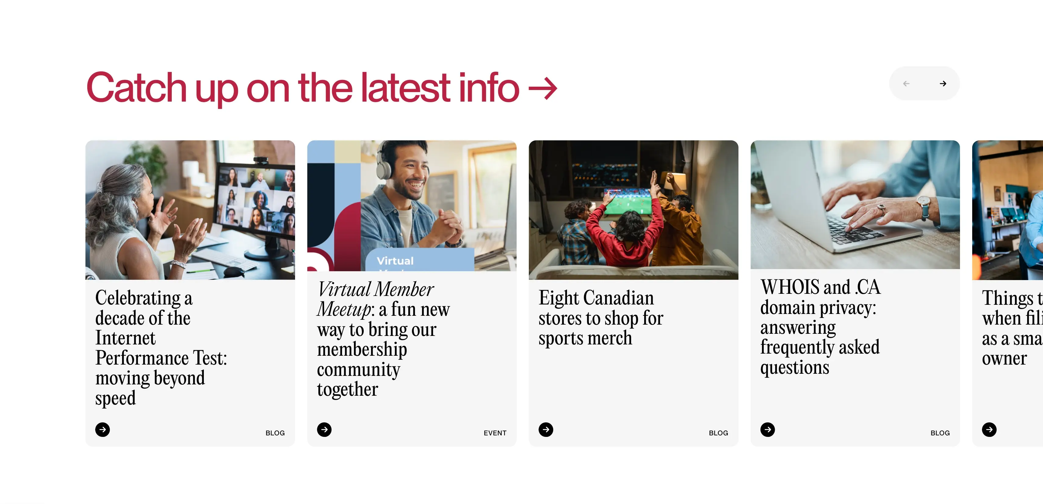
Cira
April 29, 2026
Expressive typefaces don't typically do well inside cards like this or when text content is dense but, someway somehow, it works here.
Light grey & red | Internet / nonprofit / tech | Website | Color, Copy, Layout, Type, Web, Cards, Feature, Swiss
light grey background, red headline, black text, clean typography, serif body headlines, sans-serif UI text, card-based layout, content cards, blog cards, image cards, grid layout, horizontal card carousel, rounded card corners, subtle shadows, minimal elevation, top image with bottom text layout, editorial-style headlines, strong hierarchy, whitespace heavy, consistent spacing, structured grid system, clean margins, modern web layout, minimalist UI, arrow navigation controls, circular arrow buttons, icon buttons, small CTA icons, monochrome icons, content feed section, blog preview section, feature section layout, content discovery UI, image thumbnails, lifestyle photography, diverse imagery, soft lighting photos, modern professional visuals, institutional design, nonprofit tech branding, calm neutral palette, usability-focused design, clarity-first UI, balanced composition, consistent card sizing, readable typography, modular design system, scalable layout, predictable UI patterns